Optimise you app onboarding process

Teaching users how to interact with your app is an essential part of the UX journey app owners need to plan. Often called app onboarding, this process traditionally uses several screens to teach users about the features of an app. Albeit useful, this process can also result in a drop off in interest and ultimately lead users to exit or delete an app before they’ve even started using it. Read on to see our tips on how to optimise the app onboarding process so it can work to your advantage.      

How to optimise your App Onboarding process:

  1. Native app onboarding
  2. Don’t treat your users like children
  3. Add a process bar
  4. Introduce new features gradually
  5. Only ask for permissions if you have to

App onboarding can be done natively

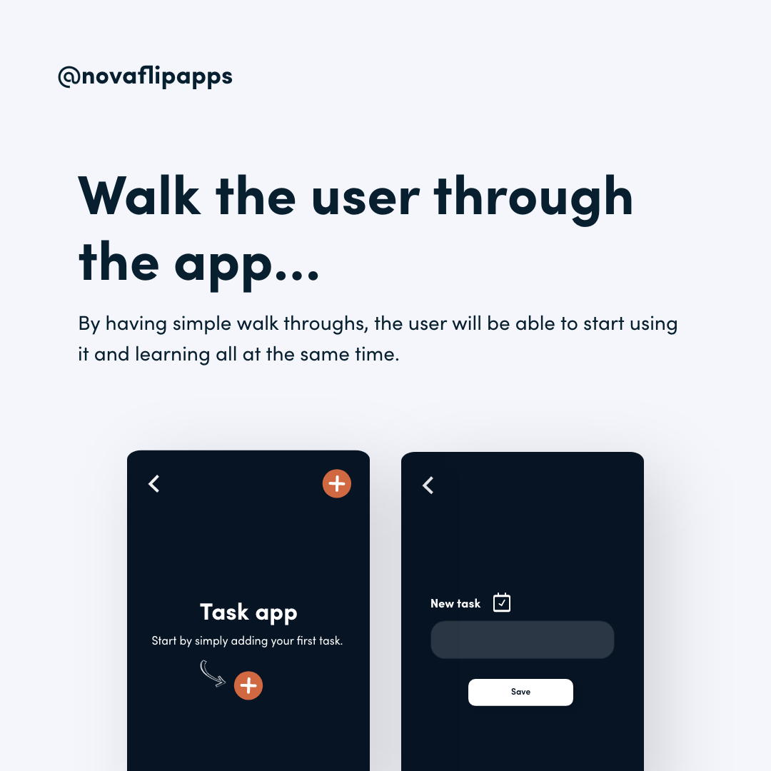
What do we mean by this? Many apps have up to 5 or 6 tutorial screens that users have to swipe through before they can use the app. While is some cases this may be useful, it is usually better to replace these static screens with an interactive walkthrough. You don’t need separate tutorial screens to teach people how to use an app. Instead, show them how it works by getting them to complete an action within the app. For example, in a task app, you can walk users through creating their first task instead of explaining it on tutorial screens. This adds an interactive layer to the onboarding process that helps users engage with your app from the get-go.

Don’t treat your users like children

As a general rule, people who download your app will have used several other apps by now. This means that they are familiar with the basic navigation and meaning of elements on a screen. For example, they know that a camera icon leads to taking a photo or video and that a heart icon will result in a like. Explaining simple features such as these can result in a boring app onboarding process which users are likely to abandon. Instead, focus on the new elements you need to teach users about.

Add a process bar to the app onboarding

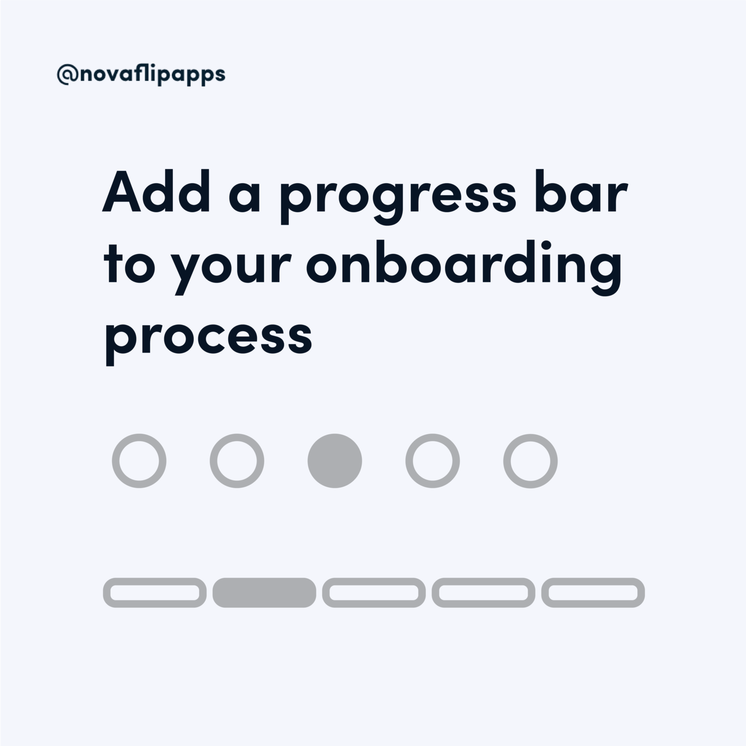
Whether you onboard people through an interactive flow or tutorial screens, it’s always good to let them know how many steps are left. This little trick will help you avoid driving away people with busy schedules by letting them know it won’t take forever. The process bar can take many shapes and forms, from lines, to dots or shapes that fill up as the onboarding goes.

Be careful when you introduce new features

New features can be a great asset to an app and attract users, but you don’t want to shock new users with complicated actions. Introduce them your product gradually and build up to more complex ideas so they don’t get scared away. A great rule to remember is that interest is generated by introducing new elements to familiar concepts. If your app’s features are too alien, users will be put off by their complexity. However, by introducing them in relation to a familiar action or element you can help them relate the novel feature to one they already know how to use.


One last thing to remember: Only asks for permissions if you have to

Access to information is a common pain point for users. A Pew research study found that 60% of the participants chose not to download an app because of the permissions it requires, while 43% deleted an app they had downloaded for the same reason. While an app does need access to certain information to function, users might be able to agree to this later on in the process. The app onboarding should teach users about the value of your product, not bombard them with access requests. As they start using an app, users can agree to data requests to access its features.

See more of our blog posts