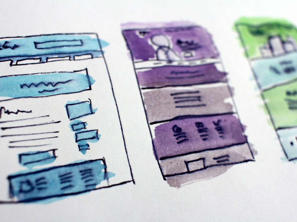
Colour palette inspiration for your app design

After a lengthy research-based UX design process, every app arrives at the initial UI design stage. Here, it is important to define the colours, fonts and overall style of your app moving forward. In some cases, full control of this process is handed over to the UI designer, in others app owners prefer to create or use their own branding and incorporate that into the UI design. Whichever scenario applies to you, we’ve put together some useful information and resources that you can use to get inspiration and put together a mood board.

What is a colour palette made up of?

Overall, a palette can consist of a variety of things – colours, their nuances, and various saturation levels. It is likely that you’ve heard some of these terms before, but it’s always good to remember them when you’re thinking about colour palettes so here they are summed up:

  • Saturation – This defines how intense a colour appears. The higher the saturation is, the more vivid a colour looks.
  • Hue – One of the defining properties of a colour, the hue represents the pure colour, such as blue, yellow, green, etc.
  • Shade – Combining a colour’s hue with black creates a shade, which increases its darkness based on the amount of black added to it.
  • Tint – Tints are achieved by mixing a colour with white to make it appear lighter.
  • Tone – The mix of a colour with grey produces what we call tones. They can vary based on the amount of grey the colour is mixed with.

Types of Colour Schemes

In colour theory, there are colour scheme standards, which help creatives develop cohesive designs. To illustrate this, we’ve put together examples of some of the most common ones below:

  • Monochromatic – consist of the different tones, shades and tints of one hue
  • Analogous – This scheme uses the 12-spoke colour wheel and is made up of 3 shades which are situated one next to the other on it
  • Complementary – another one that uses the colour wheel, this scheme uses juxtaposing colours and is perfect for achieving contrast

Online colour palette pickers – Pros & Cons

All in all, there are countless websites and apps that generate colour palettes online. While they can be fun to use and offer a ready-made solution, they also have a few negatives. Firstly, viewing colours on a screen is extremely tiring to the eyes. Due to this, most viewers will feel fatigued in a few minutes and either give up or settle for an easy option. Another issue is that all of these websites offer similar options. With many people using them and giving up quickly, the final results often end up being all too similar.

Having said that, it is still worth giving this approach a go. Here are a few tools we’ve found have great variety and features:


  • Khroma – This tool invites users to pick 50 colours they like at the start and uses AI to generate colour palettes that will match their taste.
  • Web Gradients – An online library of gradients that users can save as colour codes or copy the use in designs by copying the CSS code.
  • Eva Colours – This is a great tool for mobile app palettes as it generates semantic palettes for different functions such as success, information and warning based on your base brand colour
  • Accessible Colour Palette Builder – Once you’ve picked your palette, enter the colours in this tool to check if the pass the Web Content Accessibility Guidelines (WCAG)

Our recommendations

Adobe Color is a great way to explore and play around with colour palettes, understand colour schemes and check for accessibility. It offers many features such as ready-made colour palettes split by industries, which can be very useful to business owners. Most importantly, it offers one of our favourite tools – extracting a colour palette from a photograph. Whether you’ve spotted an image with great colours online or want to base your brand colours on yesterday’s sunset, this feature can do it all for you.

Finally, we recommend this great article by Cameron Chapman. It talks about the power of colours in evoking emotions and how to balance them in a design. By understanding your customers, you can pick colours tailored to their interests and preferences.

Save it for later!

Did you find this blog post useful? Save it in your bookmarks and come back to it next time you need colour palette resources. You can also get in touch with us with any feedback or questions, we’re alwasy happy to hear from our readers!

See more of our blog posts

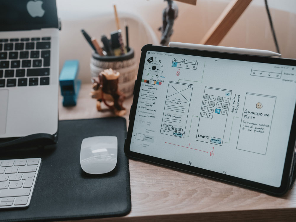
UX and UI Design: What’s the difference

UX and UI Design: What's the difference? When it comes to creating products, one of the main points to consider is how users will interact with them. UX and UI, or User Experience and User Interface, are the two main drivers of success in this area. Whether you’re...

Type scale in mobile app UI design

Type scale in mobile app UI design ype scale is an important part of reading and understanding the text we see. It is defined as the progression of font sizes in the text we read and tends to be standard across a website or an app. In this blog post, we’ll take a look...