E-commerce app design: 4 Tips to set you up for success

More and more businesses are using e-commerce apps to reach their customers. It’s a great way to offer a branded experience, remove the distractions of a web browser and allow users to shop from any place with an internet connection. More than just that, e-commerce apps allow businesses to reach customers through push notifications and get valuable insights from the way they use their app.

Optimise your e-commerce app for conversion

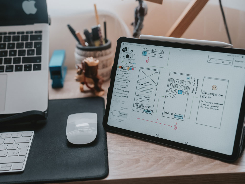
With all of this in mind, we want to offer some tips on how the right user interface can boost e-commerce app sales and lower drop off rates. The interaction users have with a phone is very different to the one they have with a laptop or computer screen. In an e-commerce app, the finger is your cursor, and everything has to be optimised to suit its natural movements. Many companies forget this and instead create a copy of their website, however that doesn’t give mobile app shoppers the best experience.


How to improve your e-commerce app sales:

  1. Add padding to your buttons
  2. Use soft shadows behind buttons
  3. Make sure your CTA stands out
  4. Optimise your purchase screen

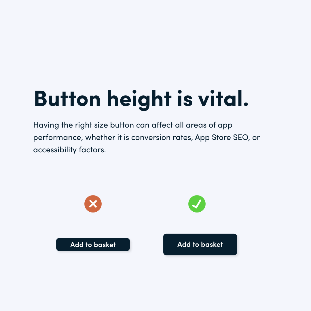
Add padding to your buttons

A badly spaced button is not only difficult to read, but it can also be a nightmare to tap. Moreover, a lack of padding on a button can affect your app’s performance by giving it a lower accessibility and SEO score on application stores. Make sure the padding you add to opposing sides of your button is equal to avoid a visual imbalance. Finally, add some white space outside of your button by adding a margin so it doesn’t overlap or stick to the text above and below it.

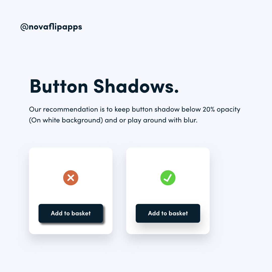
Use soft shadows behind buttons

This tip is general and it is important to remember that some design styles work great with harsher shadows. However, in the majority of cases, e-commerce platforms utilise a minimalist aesthetic that flows nicer with softer shadows. UI designers can achieve a variety of effects by playing with the shadow of a button, but we recommend sticking to industry standards and simple designs when it comes to e-commerce apps.

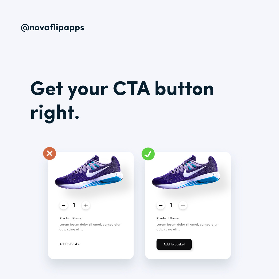
Make sure your CTA stands out

There is a vast choice of button styles out there and they can all be used to create stunning designs. However, when it comes to product screens on e-commerce apps, the priority should be clarity and contrast.


Although text buttons, ghost buttons and other creative styles might look nice, an app screen should ultimately deliver a simple experience that doesn’t leave much to the imagination. You want to provide an easy cohesive experience that guides customers to complete a purchase without any distractions.

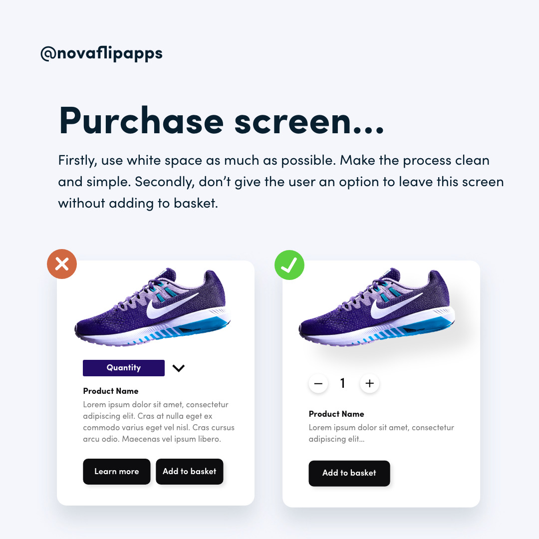
Optimise your purchase screen

As with our previous advice, this point emphasises the importance of simplicity in e-commerce apps. Make sure all the essential information is clearly visible on one screen and doesn’t require scrolling or other distracting tasks.


If your products have long descriptions, show a short preview of the text and allow users to reveal the rest of the description by tapping on it. Avoid having multiple buttons as that gives users the option to leave the screen without adding the product to their basket. In cases where you need to add a second button, make sure you make the ‘Add to basket’ CTA stand out and make it the primary focus of the screen.

Don’t have an e-commerce app yet?

We recently wrote about the benefits e-commerce apps can bring to business owners in our blog. It is a great way to create a loyal customer base, reach customers on their devices and grow your brand awareness. 

See more of our blog posts

UX and UI Design: What’s the difference

UX and UI Design: What's the difference? When it comes to creating products, one of the main points to consider is how users will interact with them. UX and UI, or User Experience and User Interface, are the two main drivers of success in this area. Whether you’re...

Type scale in mobile app UI design

Type scale in mobile app UI design ype scale is an important part of reading and understanding the text we see. It is defined as the progression of font sizes in the text we read and tends to be standard across a website or an app. In this blog post, we’ll take a look...